Shortcodes
Except the WordPress native shortcodes, we developed the shortcode which allows you to manage your editor’s layout and the shortcode for contact form.
Tab Shortcode #
Tabbed content allows you to display content in tabs.
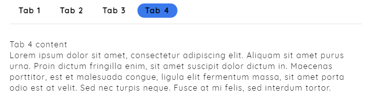
Horizontal Tab Example
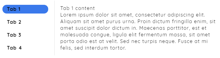
Vertical Tab Example
Example
[certy_tabs_wrapper type='horizontal]
[certy_tab_title_wrapper]
 [certy_tab_title for='1']Tab 1[/certy_tab_title]
 [certy_tab_title for='2']Tab 2[/certy_tab_title]
[/certy_tab_title_wrapper]
[certy_tab_content_wrapper]
 [certy_tab_content id='1'] Tab 1 content[/certy_tab_content]
 [certy_tab_content id='2'] Tab 2 content[/certy_tab_content]
Parameters
- type
- Can be one of these values: horizontal (default) or vertical.
- for
- type the number to bind with apropriate content
- id
- Content number.
Buttons #
Buttons can lead to internal or external links. Buttons have its own link, caption (Text) and style.
Examples:
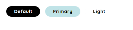
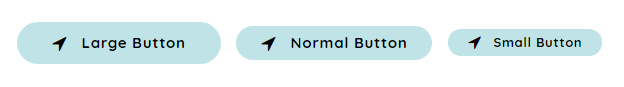
[certy_button button_text='Download' button_link='#' target='_blank' style='circle|thin' color='primary|light|default' size='small|medium|large' icon='icon class']
[certy_button button_text='Download' button_link='#' target='_blank' style='circle|thin' color='default' size='small' icon='icon class']
[certy_button button_text='Download' button_link='#' target='_blank' style='thin' color='default' size='small' icon='icon class']
[certy_button button_text='Download' button_link='#' target='_blank' style='circle' color='light' size='small' icon='icon class']
[certy_button button_text='Download' button_link='#' target='_blank' style='circle' color='primary' size='small' icon='crt-icon-close']
Parameters
- button_text button_link
- The URL path where the button links to. For example, http://www.example.com/
- target
- Can be one of these values: blank (for new window), self (for same window).
- style
- Can be one of these values: circle or thin
- color
- Can be one of these values: primary|light|default which you can change at customizer options
- size
- Can be one of these values: small|medium|large
- icon
- Here you can put the icon class and the icon will appear before the button text
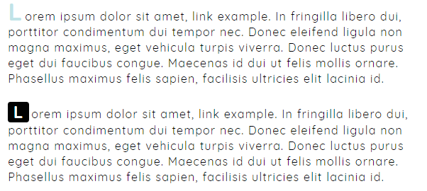
Dropcap #
Dropcap is a large initial letter that drops below the first line of a paragraph, usually used at the beginning of a section or chapter of a book.
Examples:
[certy_dropcup color='default|primary' background_color='default|primary']L[/certy_dropcup]
Parameters
- color
- Can be primary ( site primary color ). Leave blank for default style.
- background_color
- Can be primary ( site primary color ). Leave blank for default style.
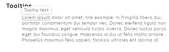
Tooltips #
Examples:
[certy_tooltip title='tooltip text']Lorem ipsum[/certy_tooltip]
Parameters
- title
- The custom text that will show in the text popup.
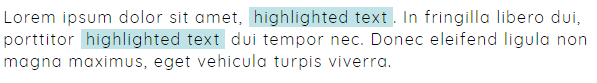
Highlight #
Examples:
[certy_highlight]highlighted text[/certy_highlight]
Columns #
There are 3 types of column shortcodes: One Half, One Third, One Fourth, you can put content, image or other shortcode to these columns
Two columns
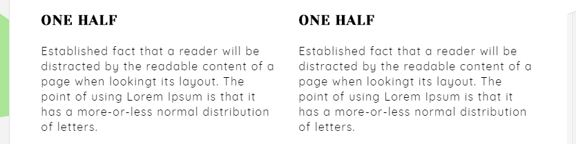
Examples:
[wrapper][one_half]
ONE HALF
Established fact that a reader will be distracted
[/one_half][one_half]
ONE HALF
Established fact that a reader will be distracted
[/one_half][/wrapper]
Three columns
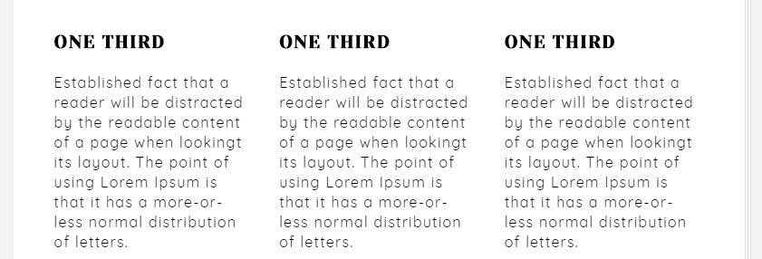
Examples:
[wrapper][one_third]
ONE THIRD
Established fact that a reader will be distracted
[/one_third][one_third]
ONE THIRD
Established fact that a reader will be distracted
[/one_third][one_third]
ONE THIRD
Established fact that a reader will be distracted
[/one_third][/wrapper]
Four columns
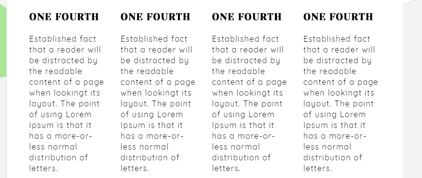
Examples:
[wrapper][one_fourth]
ONE FOURTH
Established fact that a reader will be distracted
[/one_fourth][one_fourth]
ONE FOURTH
Established fact that a reader will be distracted
[/one_fourth][one_fourth]
ONE FOURTH
Established fact that a reader will be distracted
[/one_fourth][one_fourth]
ONE FOURTH
Established fact that a reader will be distracted
[/one_fourth][/wrapper]
Progress Bars #
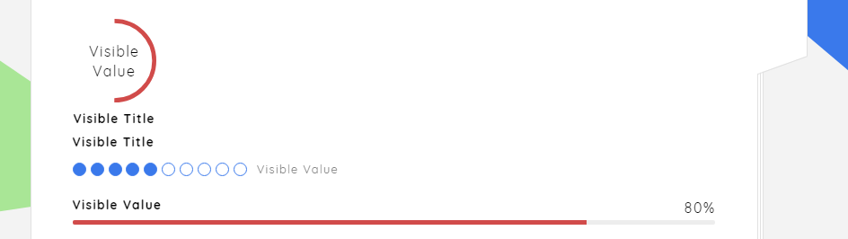
Examples:
[circle_bar visible_value='Visible Value' bar_value='50']Visible Title[/circle_bar]
[dote_bar visible_value='Visible Value' bar_value='5']Visible Title[/dote_bar]
[line_bar visible_value='Visible Value' bar_value='80']
Parameters
- visible_value
- The visible value for users.
- bar_value
- The true bar value in range of 1-100.
Sliders #
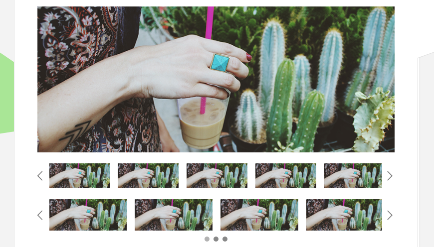
Examples:
[certy_slider dotes='false' slides_count='1'][slide image_link=''][slide image_link=''][slide image_link=''][/certy_slider]
Parameters
- dotes
- If not flase then the dotes will be shown.
- slides_count
- How many slides to be shown
- image_link
- the image link url.
Alerts #
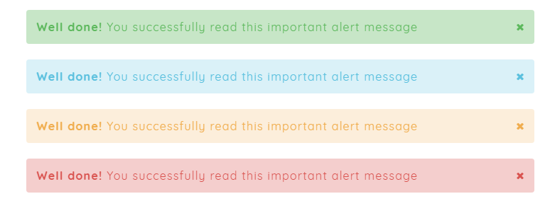
Examples:
[certy_alert type='success']Well done! You successfully read this important alert message[/certy_alert]
[certy_alert type='info']Well done! You successfully read this important alert message[/certy_alert]
[certy_alert type='warning']Well done! You successfully read this important alert message[/certy_alert]
[certy_alert type='danger']Well done! You successfully read this important alert message[/certy_alert]
Parameters
- type
- Can be success|info|warning|danger.
Lines #
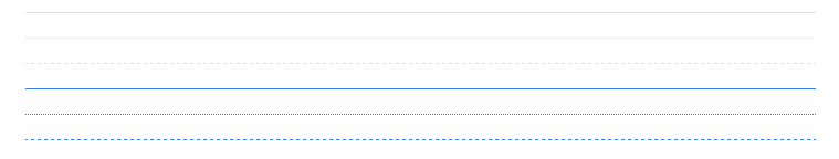
For lines you just need to use the wordpress default “Horizontal Line” button. You can change the line style by adding the class attribute to “hr” element when switching to text editor
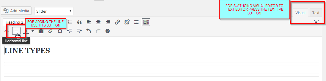
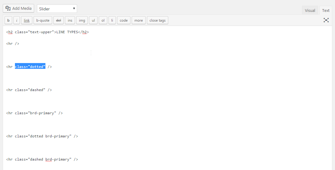
Parameters
- class
- Can be dotted|dashed|brd-primary|dotted brd-primary|dashed brd-primary.
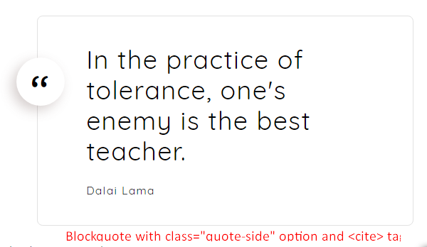
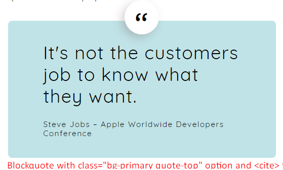
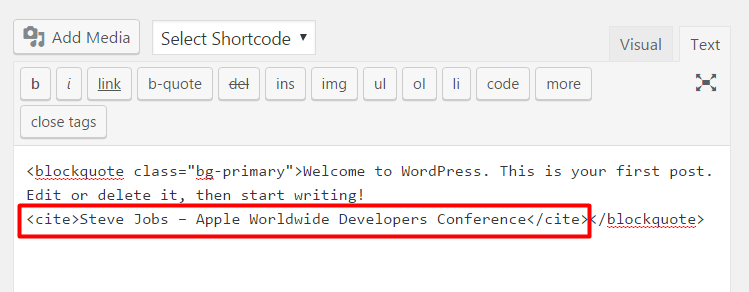
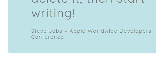
Blockquotes #
For blockquotes you just need to use the wordpress default “Blockquote” button. You can change the Blockquote style by adding the class attribute to “blockquote” element when switching to text editor
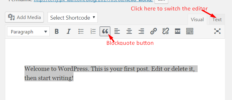
For Blockquote styling add the “class” attribute with options below
Parameters
- class
- bg-primary – adds the primary background color to blockquote
quote-side – adds the ” symbol to the left
quote-top – adds the ” symbol to the top
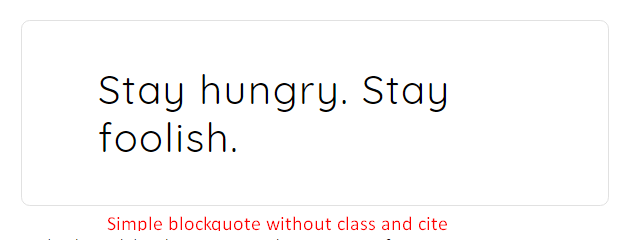
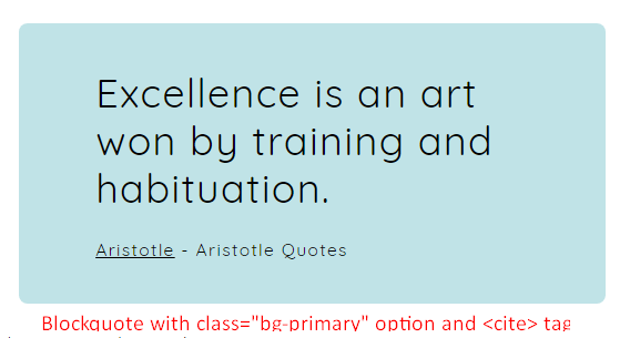
Also you can use the Small Text Goes Here and put it in blockquote
Toggle Link #
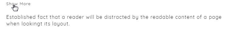
Examples:
[certy_toggle_link toggle_text='Show More']Established fact that a reader will be distracted by the readable content of a page when lookingt its layout.[/certy_toggle_link]
Parameters
- toggle_text
- the text on the toggle link.
Socials and Share #
Examples:
Parameters