Site Layout
This is the site main layout:
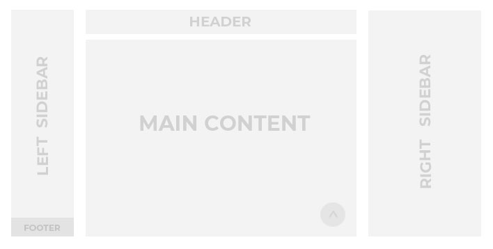
In the documentation, we will always focus on the site layout desktop version, using names according with the above picture (please use the same terms when you will write to our support theme).
Header
Left Sidebar
Main Content
Right Sidebar
Footer
As people are already using mobile devices more than desktop computers to access the web, it’s important to always check and pay attention on your website mobile view.
Please pay attention that the site layout for the mobile devices is different and some elements may be hidden (see provided screenshots below) for example :
- Logo will be hidden for mobile view, so would be better to always keep “Home” menu item, otherwise users can’t go back to the home page from other pages.
If you use Intro section “Home” menu item can navigate right to Intro section – https://sitename.com/#intro.
If you don’t use Intro section than “Home” menu item can navigate to – https://sitename.com . - Social Icons, Copyright Text and Button located in the Left Sidebar will be hidden for mobile view, but there are alternative elements in the Intro Section.
- If Intro section is hidden, you will have no mobile footer.
Site Desktop Layout #

Site Mobile Layout #