Shortcodes
Except the WordPress native shortcodes, we developed the shortcodes which allows you to make your site more unique have rich features for editor and add contact form in any editor. Below is the list of available shortcodes for Boombox theme.
Tab Shortcode #
Tabbed content allows you to display content in tabs.
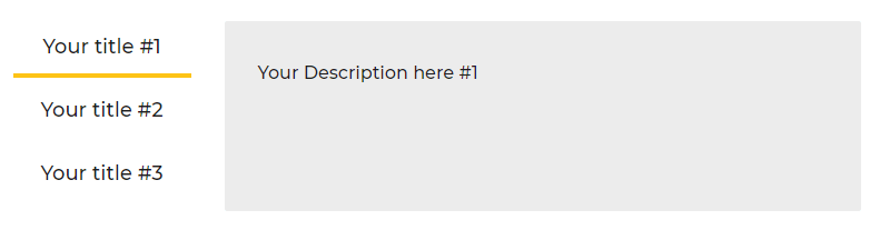
Horizontal Tab Example
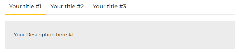
Vertical Tab Example
Example:

[boombox_tabs layout="vertical" active="1" classes="class-name"]

[boombox_tab title="Your title #1"]Your Description here #1[/boombox_tab]

[boombox_tab title="Your title #2"]Your Description here #2[/boombox_tab]

[boombox_tab title="Your title #3"]Your Description here #3[/boombox_tab]

[/boombox_tabs]
Parameters
- layout
- Can be one of these values: horizontal (default) or vertical.
- active
- Active tab number. Default: 1
- classes
- Class names separated by spaces.
Buttons #
Buttons can lead to internal or external links. Buttons have its own link, caption (Text) and style. 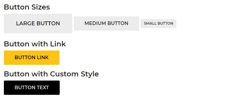
Examples:

[boombox_button tag_type="a"  type="primary"

url="http://www.example.com/" target="blank" class="class-name1

class-name2"]Button Text[/boombox_button]

[boombox_button tag_type="button"  background_color="#000000" text_color="#cccccc" ]Button Text[/boombox_button]

[boombox_button tag_type="button" size="large"]Large button[/boombox_button]

[boombox_button tag_type="button" size="small"]Small button[/boombox_button]
Parameters
- tag_type
- Can be one of these values: a(default) or button.
- type
- Can be one of these values: primary( dark blue ), secondary ( gray ), success ( green ), info( info ), warning ( warning ) or danger (danger). By default your button color will be set from customizer setting.
- size
- Can be one of these values: large or small. Leave Blank for default size.
- url
- The URL path where the button links to. For example, http://www.example.com/
- target
- Can be one of these values: blank (for new window), self (for same window).
- background_color
- Accepts a hexcode (#000000), RGBA (rgba(0,0,0,1)) or certain colors such as red, or transparent. By default your button background color will be set from customizer setting.
- text_color
- Accepts a hexcode ( #000000 ), RGBA ( rgba(0,0,0,1) ) or certain colors such as red, or transparent. By default your button text color will be set from customizer setting.
- class
- Add a custom class to the HTML element for further css customization.
Dropcap #
Dropcap is a large initial letter that drops below the first line of a paragraph, usually used at the beginning of a section or chapter of a book. 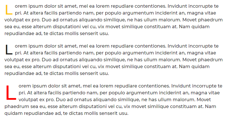
Examples:

[boombox_dropcap style="primary" font_size="48px"

class="class-name"] L [/boombox_dropcap]orem ipsum dolor sit amet,

consectetur adipiscing elit. Donec sit amet consectetur ante.

[boombox_dropcap font_size="48px" class="class-name"] L

[/boombox_dropcap]orem ipsum dolor sit amet, consectetur adipiscing

elit. Donec sit amet consectetur ante. Maecenas accumsan tellus

porttitor nisl gravida feugiat.

[boombox_dropcap style="primary" font_size="70px" color="red"

class="class-name"] L [/boombox_dropcap]orem ipsum dolor sit amet,

consectetur adipiscing elit. Donec sit amet consectetur ante. Maecenas

accumsan tellus porttitor nisl gravida feugiat.
Parameters
- style
- Can be primary ( site primary color ). Leave blank for default style.
- font_size
- Accepts a pixel value. For example, 20px.
- color
- Accepts a hexcode ( #000000 ), RGBA ( rgba(0,0,0,1) ) or certain colors such as red, or transparent.
- class
- Add a custom class to the wrapping HTML element for further css customization.
Tooltips #
Examples:
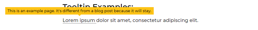
[boombox_tooltip title="This is an example page. It's different
from a blog post because it will stay." class="tooltip-test-class"]
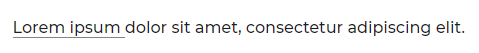
Lorem ipsum [/boombox_tooltip]
dolor sit amet, consectetur adipiscing elit.
Parameters
- title
- The custom text that will show in the text popup.
- class
- Add a custom class to the wrapping HTML element for further css customization
Highlight #
Examples:
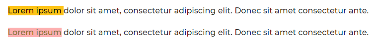
[boombox_highlight style="primary"
class="highlights-test-class"] Lorem ipsum [/boombox_highlight] dolor
sit amet, consectetur adipiscing elit. Donec sit amet consectetur ante.
[boombox_highlight background_color="#fdafaf"
text_color="#88702a" class="highlights-test-class"] Lorem ipsum
[/boombox_highlight] dolor sit amet, consectetur adipiscing elit. Donec
sit amet consectetur ante.
Parameters
- style
- Can be primary ( site primary color ). Leave blank for default style.
- background_color
- Accepts a hexcode ( #000000 ), RGBA ( rgba(0,0,0,1) ) or certain colors such as red, or transparent. By default your button background color will be set from customizer setting.
- text_color
- Accepts a hexcode ( #000000 ), RGBA ( rgba(0,0,0,1) ) or certain colors such as red, or transparent. By default your button text color will be set from customizer setting.
- class
- Add a custom class to the HTML element for further css customization.
Columns #
There are 3 types of column shortcodes: One Half, One Third, One Fourth, you can put content, image or other shortcode to these columns
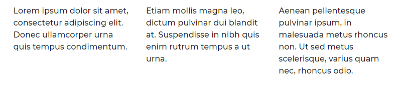
Two columns
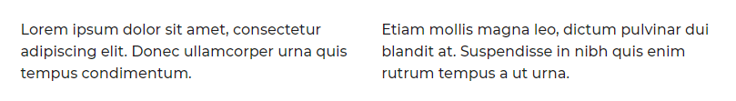
boombox_row][boombox_one_half] Some content [/boombox_one_half][boombox_one_half]Some content [/boombox_one_half][/boombox_row]
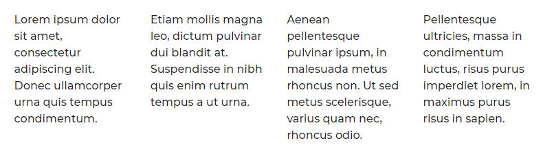
Three columns
[boombox_row][boombox_one_third] Some content [/boombox_one_third][boombox_one_third]Some content [/boombox_one_third]

[boombox_one_third] Some content [/boombox_one_third][/boombox_row]
Four columns
[boombox_row][boombox_one_fourth]

Some content [/boombox_one_fourth][boombox_one_fourth] Some content

[/boombox_one_fourth]

[boombox_one_fourth] Some content

[/boombox_one_fourth][boombox_one_fourth] Some content

[/boombox_one_fourth][/boombox_row]
Thumbnails #
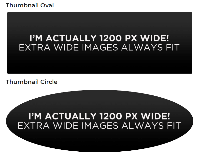
Examples:

[boombox_thumbnail style="border"]<img src="image_src" alt="" />[/boombox_thumbnail]

[boombox_thumbnail style="circle"]<img src="image_src" alt="" />[/boombox_thumbnail]
Parameters
- style
- Can be circle or border (default)
Contact form #
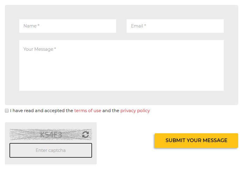
Examples: [boombox_contact_form message_placeholder="Your message" label_submit="Submit Your Message" captcha="0"]
Parameters
- message_placeholder
- Your Message (default)
- label_submit
- Submit Your Message (default)
- captcha
- 0 ( disable ), 1 ( enable )
Please note, that as default email address contact form using email address added in Dashboard ▸ Settings ▸ General ▸ Email address