Top and Bottom header menus
Boombox provide header constructor with unlimited setup variations.
You can find settings for that in Customizing ▸ Header ▸ Layout.
Top Layer

- On/Off switcher
- Top Layer can be disabled or enabled
- Composition
- is the options which show the way how you can organize header components. What you need to know is that you can have components on Left side which is L and on Right side which is R. Pay attention as well to Logo Position, Menu position and Ad.
- Width
- Top Layer Width can be Boxed or Full Width
- Height
- Top Layer Height can be Small or Medium or Large
Bottom Layer
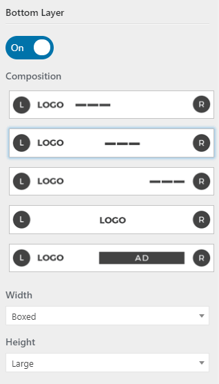
- On/Off switcher
- Bottom Layer can be disabled or enabled
- Composition
- is the options which show the way how you can organize header components. What you need to know is that you can have components on Left side which is L and on Right side which is R. Pay attention as well to Logo Position, Menu position and Ad.
- Width
- Bottom Layer Width can be Boxed or Full Width
- Height
- Bottom Layer Height can be Small or Medium or Large
Components Positions
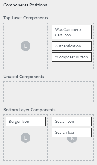
For admins convenience we have created Components Position in a way which is extremely easy to use and organize. Just drag and drop Unused Components which are in the middle in Top Layer Components L or R area on top or drag and drop in Bottom Layer Components L or R area at the bottom.
Other options
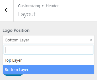
- Logo Position
- choose in what layer show the logo: Top layer or Bottom layer
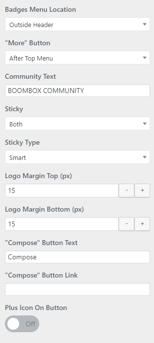
- Badges Menu Location
- From this menu set Badges Menu location Outside Header (Top Layer and Bottom Layer) or Inside Header or set as None. When Inside Header selected then Badges Menu appears in Unused Components, thus admin can set location of Badges menu from Components Position in Top Layer or Bottom Layer . When Badges Menu location set as None that means that Badges menu will be hidden from Header.
- “More” Button
- In Boombox you can extend header and especially menu functionality by adding More Button which have pop-out menu with options to include many components. You can control position to set After Top Menu or Bottom Menu. You can add or remove elements in More button menu from Menus.
- Community Text
- This text is visible under the more button, just type in desirable text or leave blank.
- Sticky
- Choose which layer will be Sticky, Top Layer or Bottom Layer, or Both or None of the layers.
- Sticky Type
- choose to show sticky header in Classic mode (will always show) or in Smart mode (will only show on scrolling back to the top )
- Logo Margin Top (px)
- can change the space size around the logo against the header borders
- Logo Margin Bottom (px)
- can change the space size around the logo against the header borders
- “Compose” Button Text
- This field for changing text on Compose Button
- “Compose” Button Link
- This field for adding custom link on Compose Button. For example, you can add Zombify post creating page which will be yoursiteurl/frontend-page/
- Plus Icon On Button
- This icon can be On or Off with trigger.
To find out how to upload Logo please read this article.